
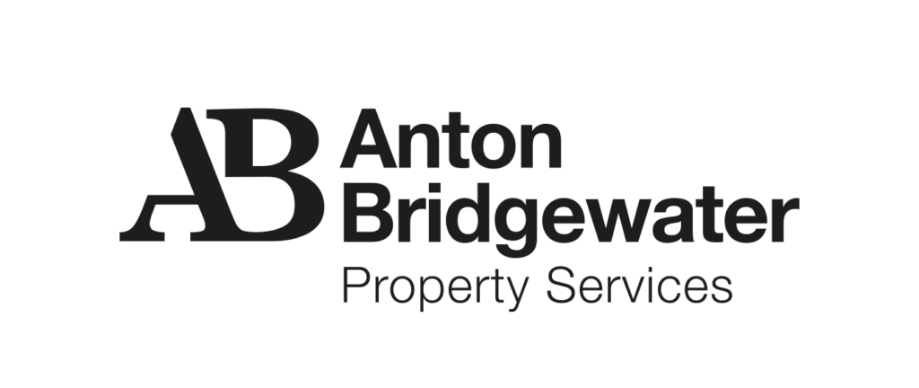
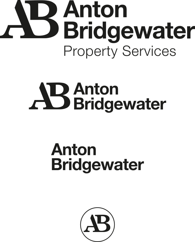
We identified a range of amendments which included; creating a clear hierarchy to distinguish between the company name and ‘property services’, using sentence case for legibility, choosing a classic font for clarity and a sense of quality and trust, and to create an ‘AB’ marque for a sense of identity, and use in smaller spaces such as social media.
Anton Bridgewater. · 2021
Anton Bridgewater.
East London property services company Anton Bridgewater came to us for a for refresh of their logo.
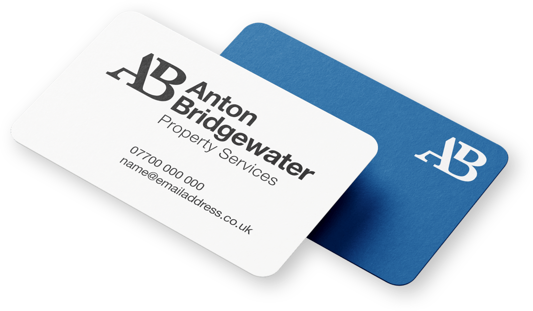
Project images
Get in touch
Let's
talk.
To arrange a meeting, discuss your business goals or even just have a quick cuppa.